파이썬 시각화 연습
난 처음에 R로 배우다 보니, ggplot으로 많이 시각화를 한다.
거기서는 특히 dplyr에 gather와 혼합을 해서 사용을 하는데, 그것과 비슷한 개념으로 코딩을 하고 싶어서
찾아봤지만, 결론은 굳이 그렇게 할 필요가 없었다
파이썬에서는 좀 더 쉽게 저차원에서 시각화를 하다 보니 좀만 알면 쉽고 이쁘게 할 수가 있었다.
파이썬에서 gather를 하려면 melt를 잘 이용해야 한다!
import pandas as pd
import numpy as np
names = [ 'Wilbur', 'Petunia', 'Gregory' ]
a = [ 67, 80, 64 ]
b = [ 56, 90, 50 ]
df = pd.DataFrame({'names':names,'a':a,'b':b})


## gather 함수
def gather( df, key, value, cols ):
    id_vars = [ col for col in df.columns if col not in cols ]
    id_values = cols
    var_name = key
    value_name = value
    return pd.melt( df, id_vars, id_values, var_name, value_name )

gather( df, 'drug', 'heartrate', ['a','b'] )

이렇게 melt를 하면 쉽게 이용가능하다.
churn data로 시각화하기
churn 비율을 pie chart로 시각화 해보기
churn = pd.read_csv("./../Data/Churn.csv")
df = churn.groupby("churn").size().reset_index(name='counts')
# Make the plot with pandas
fig, ax = plt.subplots(figsize=(12, 7), subplot_kw=dict(aspect="equal"), dpi= 80)

data = df['counts']
categories = df['churn']
explode = [0.1 ,0.0]

def func(pct, allvals):
    absolute = int(pct/100.*np.sum(allvals))
    return "{:.1f}% ({:d} )".format(pct, absolute)


wedges, texts, autotexts = ax.pie(data,
                                  autopct=lambda pct: func(pct, data),
                                  textprops=dict(color="w"),
                                  colors=plt.cm.Dark2.colors,
                                 startangle=140,
                                 explode=explode)

ax.legend(wedges, categories, title="Churn Class", loc="center left", bbox_to_anchor=(1, 0, 0.5, 1))
plt.setp(autotexts, size=10, weight=700)
ax.set_title("Class of Churn : Pie Chart")
plt.show()
다음으로는 속성별로 나눠서 진행하기 위한 과정 진행
int_type = churn.select_dtypes("int64").columns.tolist()
object_type = churn.select_dtypes("object").columns.tolist()
object_type = list(set(object_type) - set(["churn"]))
types = int_type + object_type
numeric_type = churn.select_dtypes("float").columns.tolist()
Categorical , Integer 변수 속성별 비율 파악하기 시각화
fig, ax = plt.subplots(3, 4, figsize=(20, 10))
for variable, subplot in zip(types , ax.flatten()):
    props = churn.groupby(variable)['churn'].value_counts(normalize=True).unstack()
    props.plot(kind='barh', stacked='True' ,ax = subplot)
    for label in subplot.get_xticklabels():
        label.set_rotation(90)
Numerical 변수, Churn 별로 Boxplot
fig, ax = plt.subplots(2, 4, figsize=(15, 10))
for var, subplot in zip(numeric_type, ax.flatten()):
    sns.boxplot(x='churn' , y = var , data=churn,ax=subplot)
gather와 boxplot를 사용해서 한꺼번에 시각화해서 보는 방법
numeric_gather = gather( churn , 'key', 'value', numeric_type )
ax = sns.boxplot(x="key", y="value", hue="churn",
                 data=numeric_gather, palette="Set3")
plt.xticks(rotation=90)
plt.show()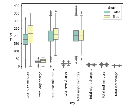
Numeric Scatter Plot도 그리고 Density도 같이 그리기
sns.set_style("whitegrid") ;
sns.pairplot( data = churn  , hue ='churn' ,vars=numeric_type  )
이것은 파이썬 처음에 EDA 할 때 많이 쓸 것 같아서 한번 만들어 봤다
각 변수별로 보고 싶은데, 보통 귀찮으니 한꺼번에 하고 싶은 경우가 많다.
위에 있는 코드를 사용하면 한 번에 볼 수 있을 것 같다.
import seaborn as sns
sns.set(rc={'figure.figsize':(15.7,11.27)})
fig , ax = plt.subplots(1,2 , figsize = (25,10))
axx = ax.flatten()
g=sns.violinplot(x="value" , y="variable", hue = "occur" , palette="Set3", split=True,
                 scale="count", inner="quartile" ,scale_hue=False ,
                 data = gg[list(missing_cut.keys()) + ["occur"]].melt("occur"), ax = axx[0])
g.set_title("Generate" , size = 30)
g=sns.violinplot(x="value" , y="variable", hue = "occur" , palette="Set3", split=True,
                 scale="count", inner="quartile" ,scale_hue=False ,
                 data = Origin[list(missing_cut.keys()) + ["occur"]].melt("occur") , ax = axx[1])
g.set_title("RAW" , size = 30)
g.set_yticklabels("")
plt.show()
참고 :
https://towardsdatascience.com/how-to-perform-exploratory-data-analysis-with-seaborn-97e3413e841d
How to Perform Exploratory Data Analysis with Seaborn
Explore a real dataset by creating attractive visualizations with the seaborn library.
towardsdatascience.com
https://github.com/mwaskom/seaborn/issues/1027
Add percentages instead of counts to countplot · Issue #1027 · mwaskom/seaborn
Hello, I would like to make a proposal - could we add an option to a countplot which would allow to instead displaying counts display percentages/frequencies? Thanks
github.com
Top 50 matplotlib Visualizations - The Master Plots (w/ Full Python Code) | ML+
A compilation of the Top 50 matplotlib plots most useful in data analysis and visualization. This list helps you to choose what visualization to show for what type of problem using python's matplotlib and seaborn library.
www.machinelearningplus.com
'분석 Python > Visualization' 카테고리의 다른 글
| [ Python ] plotly express facet_row , col scale free 하는 법 공유 (0) | 2019.10.18 |
|---|---|
| [ Python ] seaborn subplots x_ticklables rotate 하는 법 (0) | 2019.09.13 |
| Python Group 별로 Bar Graph 그릴 때, (0) | 2019.06.09 |
| Python에서 RocCurve 시각화하기. (0) | 2019.05.18 |
| Confusion matrix 시각화 (0) | 2019.05.14 |