728x90
개인적으로 R을 하였을 때 ggplot을 자주 사용하였다.
거기서 facet_row를 통해서 여러 변수를 분리해서 표현하는데, R에서는 scales = free라는 것을 제공해서 아주 예쁘게 그려준다.

그러나 파이썬에서는 이런 시각화를 ggplot만큼 grammar로 편하게 해주는 것을 찾지 못하다가,
plotly express가 나올 때 딱 ggplot의 느낌을 받았다.
그래서 몇가지 실험을 해보다가 아쉬운 것을 발견했다.
먼가 변수별로 나눠서 표현하고 싶어서 해보니 다음과 같이 나왔다.
import numpy as np
d = pd.DataFrame(np.concatenate( (features , np.expand_dims(target, axis = 1)), axis = 1))
d.columns = feature_names + ["target"]
dd = d.melt(id_vars="target")
fig = px.box(dd, x="variable", y="value",
                 facet_col="variable" ,color = "target")
fig.show()
기본적으로 그냥 scale을 유지하게 나오는 것이다.
그래서 scale 조정하는 찾아보려고 했지만, 먼가 나오지 않아서 좌절하고 안 쓰다가 드디어 방법을 찾게 되어서 공유한다.
일단 버전 체크

그리고 짠!
fig = px.box(dd, x="variable", y="value",
                 facet_col="variable" ,color = "target")
fig.update_yaxes(showticklabels=True , matches=None)
fig.update_xaxes(showticklabels=True , matches=None)
fig.show()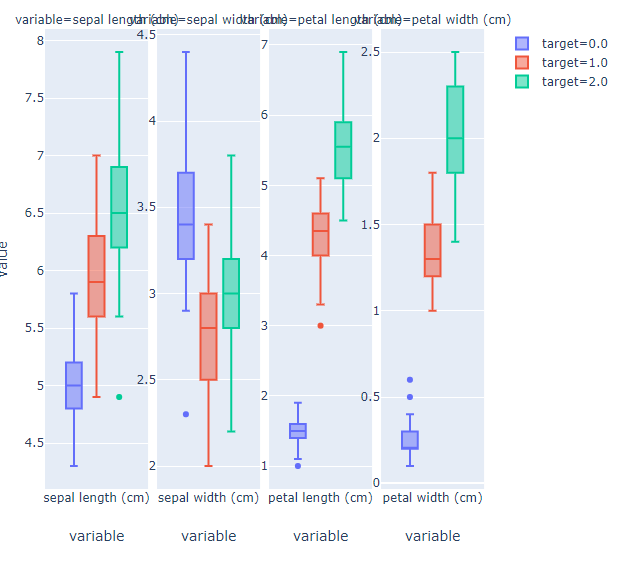
BarGraph도 가능하다
import plotly.express as px
tips = px.data.tips()
dd = tips[["sex", "smoker", "day","time"]]
ddd = dd.melt(id_vars=["time"])
fig = px.bar(ddd, x="variable", y="value", color="time"
             ,facet_col="variable", barmode="group")
fig.update_yaxes(showticklabels=True , matches=None)
fig.update_xaxes(showticklabels=True , matches=None)
fig.show()
'분석 Python > Visualization' 카테고리의 다른 글
| [ Python ] visualization 결과 객체값으로 저장하기 (0) | 2019.11.26 |
|---|---|
| [ Python ] 신뢰구간 시각화하기 (lineplot or fill_between) (0) | 2019.10.31 |
| [ Python ] seaborn subplots x_ticklables rotate 하는 법 (0) | 2019.09.13 |
| 파이썬에서 R처럼 gather 함수와 자주 쓸 것 같은 시각화 코드 (0) | 2019.07.06 |
| Python Group 별로 Bar Graph 그릴 때, (0) | 2019.06.09 |