728x90
import pandas as pd
import seaborn as sns
from sklearn.datasets import load_iris
def make_df(dict_) :
    pd_result = pd.DataFrame(dict_["data"])
    if dict_.get("feature_names",None) is not None  :
        pd_result.columns = dict_["feature_names"]
    if dict_.get("target",None) is not None  :
        pd_result["target"] = dict_["target"]
        if dict_.get("target_names", None) is not None :
            d = dict(zip(np.unique(dict_["target"]), dict_["target_names"]))
            pd_result = pd_result.replace({"target" : d})
    return pd_result

x = make_df(load_iris())
x.head()
일단 처음에 sepal length ~ petal width까지 한 번에 시각화하기 위해서 wide 포맷에서 long 포맷으로 변경을 해준다.
master_x = x.melt(id_vars = ["target"])
master_x.head()
이제부터 sns.FacetGrid에 row와 hue를 정해서 시각화할 수 있다.
여기서는 kdeplot 으로 kernel density plot을 그려보고자 한다.
g = sns.FacetGrid(master_x, #the dataframe to pull from
                  row="variable", #define the column for each subplot row to be differentiated by
                  hue="target", #define the column for each subplot color to be differentiated by
                  aspect=10, #aspect * height = width
                  height=1.5, #height of each subplot
                  palette=['#4285F4','#EA4335','#FBBC05','#34A853'] #google colors
                 )
g.map(sns.kdeplot, "value", shade=True, alpha=1, lw=1.5, bw=0.2)
seaborn 뿐만 아니라 plt 계열도 가능하다.
(sns.boxplot은 가능하지 않았음)(아쉽)
g = sns.FacetGrid(master_x, #the dataframe to pull from
                  row="variable", #define the column for each subplot row to be differentiated by
                  hue="variable", #define the column for each subplot color to be differentiated by
                  aspect=10, #aspect * height = width
                  height=1.5, #height of each subplot
                  palette=['#4285F4','#EA4335','#FBBC05','#34A853'] #google colors
                 )
g.map(plt.hist, "value")
g = sns.FacetGrid(master_x, #the dataframe to pull from
row="variable", #define the column for each subplot row to be differentiated by
hue="target", #define the column for each subplot color to be differentiated by
aspect=10, #aspect * height = width
height=1.5, #height of each subplot
palette=['#4285F4','#EA4335','#FBBC05','#34A853'] #google colors
)
g.map(sns.kdeplot, "value", lw=4, bw=0.2)
def label(x, color, label):
ax = plt.gca() #get the axes of the current object
ax.text(0, .2, #location of text
label, #text label
fontweight="bold", color=color, size=20, #text attributes
ha="left", va="center", #alignment specifications
transform=ax.transAxes) #specify axes of transformation
g = sns.FacetGrid(master_x, #the dataframe to pull from
                  row="variable", #define the column for each subplot row to be differentiated by
                  hue="target", #define the column for each subplot color to be differentiated by
                  aspect=10, #aspect * height = width
                  height=1.5, #height of each subplot
                  palette=['#4285F4','#EA4335','#FBBC05','#34A853'] #google colors
                 )
g.map(sns.kdeplot, "value", lw=4, bw=0.2)
g.map(label, "target") #the function counts as a plotting object!

sns.set(style="white", rc={"axes.facecolor": (0, 0, 0, 0)})
g.fig.subplots_adjust(hspace= -.25)

g = sns.FacetGrid(master_x, #the dataframe to pull from
                  row="variable", #define the column for each subplot row to be differentiated by
                  hue="target", #define the column for each subplot color to be differentiated by
                  aspect=10, #aspect * height = width
                  height=1.5, #height of each subplot
                  palette=['#4285F4','#EA4335','#FBBC05','#34A853'] #google colors
                 )
g.map(sns.kdeplot, "value", lw=4, bw=0.2)
g.map(label, "target") #the function counts as a plotting object!
g.set_titles("") #set title to blank
g.set(yticks=[]) #set y ticks to blank
g.despine(bottom=True, left=True) #remove 'spines'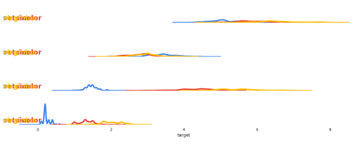
seaborn에서 다중 플랏을 그리기 위해서 FacetGrid를 활용해봤다.
여러 가지 변수를 한꺼번에 비교할 때 좋을 것 같다는 생각이 든다.
물론 이것을 대체할 수 있는 plotly.express도 있고 다양하게 있지만, 좋은 코드인 것 같아서 글을 남겨본다.
'분석 Python > Visualization' 카테고리의 다른 글
| Hiplot 으로 하이퍼 파라미터 시각화하기 (0) | 2020.07.09 |
|---|---|
| Pandas 에서 Plotly backend 사용하기 (0) | 2020.07.02 |
| sinkhorn으로 동영상 만들어보기 (0) | 2020.05.27 |
| CNN 시각화 사이트 소개 (Convolutional Neural Networks) (0) | 2020.05.03 |
| seaborn layout 동적으로 만드는 방법 소개 (0) | 2020.04.19 |